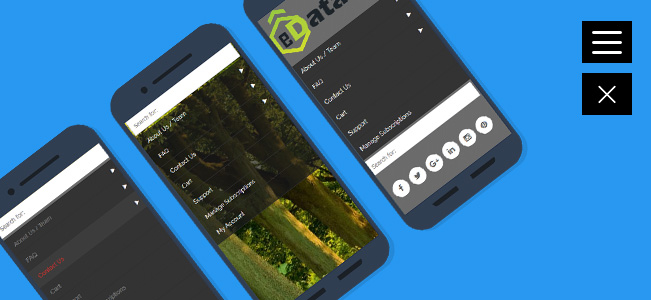
eds Responsive menu is a responsive WordPress menu plugin that generates area economical vertical, horizontal push/sliding/static navigation, icon toolbar or fullscreen menu on your choice. It will be used as standalone navigation or compliment your main menu. eds Responsive menu makes navigation much user-friendly and easier each on desktops and mobiles. idea of slide in vertical, horizontal menu that tried itself on mobiles currently shines on desktops too! It may be used as always visible navigation as well.
Create your custom WordPress menu in a few easy steps. eds Responsive menu allows you to easily and intuitively create a slick and professional WordPress menu. From the most complex “Mega Menu”, rich with features, down to the simplest of menus with simple drop-downs,siding.
Image Backgrounds
Add variety and fresh look for your superfly menu with image background options.
Totally Flexible
eds Responsive menu can be used right out of the box by dropping a single line of code into your theme, or you can customize it out the wazoo to give it your own flair.
Colour Opacity
Want to be ready to set the opacity for ALL colors utilized by the plugin to allow for semi-transparent backgrounds or text colors if you please? Purchase the pro version and every one that power will be yours.
Rapid Development
eds Responsive menu takes care of all the nuances of navigation menus and mobile devices so you can focus on developing your awesome theme.
Lightweight
eds aims to be robust but lightweight, so it loads and runs quickly and responsively on all your devices.
Toggle icon Settings
Set custom size change color use your icon burge line width burge line gap.
Features Overviews
- Set your width breakpoint (where your menu switches from your standard menu to a select box)
- Configure how many levels you wish to include in the select menu. Set it to 1 to include only the All level menu items.
- Slide in menu, static menu, compact icon navbar, skewed panel, fullscreen mode.
- Show/hide on mobiles, show/hide on desktops, show on specific pages, show for logged in users etc.
- Choose font family, size, alignment, line-height, colors and more!
- Design your menu items by adding images, chapters, separators, icons, second row text etc. Change font settings, colors, background image, your logo and more!
- Multi-level menus support. Proper adaptation for both desktop and mobile devices.
- Smooth scroll, side, accordion
- Fully responsive and works on all type of mobile devices.
- Easily integrates with wordpress menu system.
- Easy to use admin interface.
- Easily replace your menu with responsive menu on mobile devices.
- Option to open menu from top, left and right.
- Social bar. Facebook, Twitter, Instagram, Pinterest, Google+, Pinterest.
Responsive Select Menu is designed to be used with any WordPress theme that supports unordered-list-based WordPress 3 menus, and is fully compatible with Agility.


eDataStyle – :
Awesome responsive menu
proyectos (verified owner) – :
Plugin works great. Recommended to add responsive menu to your WordPress site.
Frank van Rooij (verified owner) – :
Great Plugin. Works perfect. Usability is good.
Rashmi Verma – :
Very Nice.. Needed the same to do for my website..